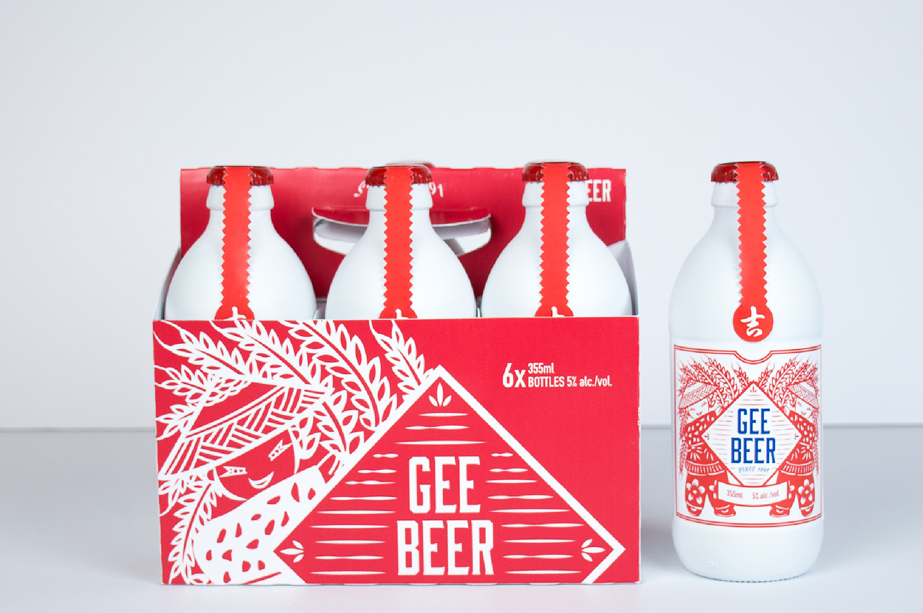
This beer packaging design was based on Chinese harvest folklore, where the main idea was inspired by Chinese folk paper cuts. Chinese paper cuts are usually symmetrical in design and use red paper, so these characteristics were applied to the label design. The imagery narrates a wonderful harvest scene, enhancing the nature of the beer which is brewed from wheat.
In general, a bumper crop means it will be an auspicious year, hence the name of the beer comes from the Chinese character meaning good luck. The white colour of the bottle is meant to help the red graphics stand out, and the blue in the typeface was chosen to contrast the red and bring focus to the name.